A Fragile Empire
Publication Design | Magazine Spread
This project’s goal was to create a clean and professional layout for a National Geographic article. The article discusses the bleaching and destruction of the Great Barrier Reef.
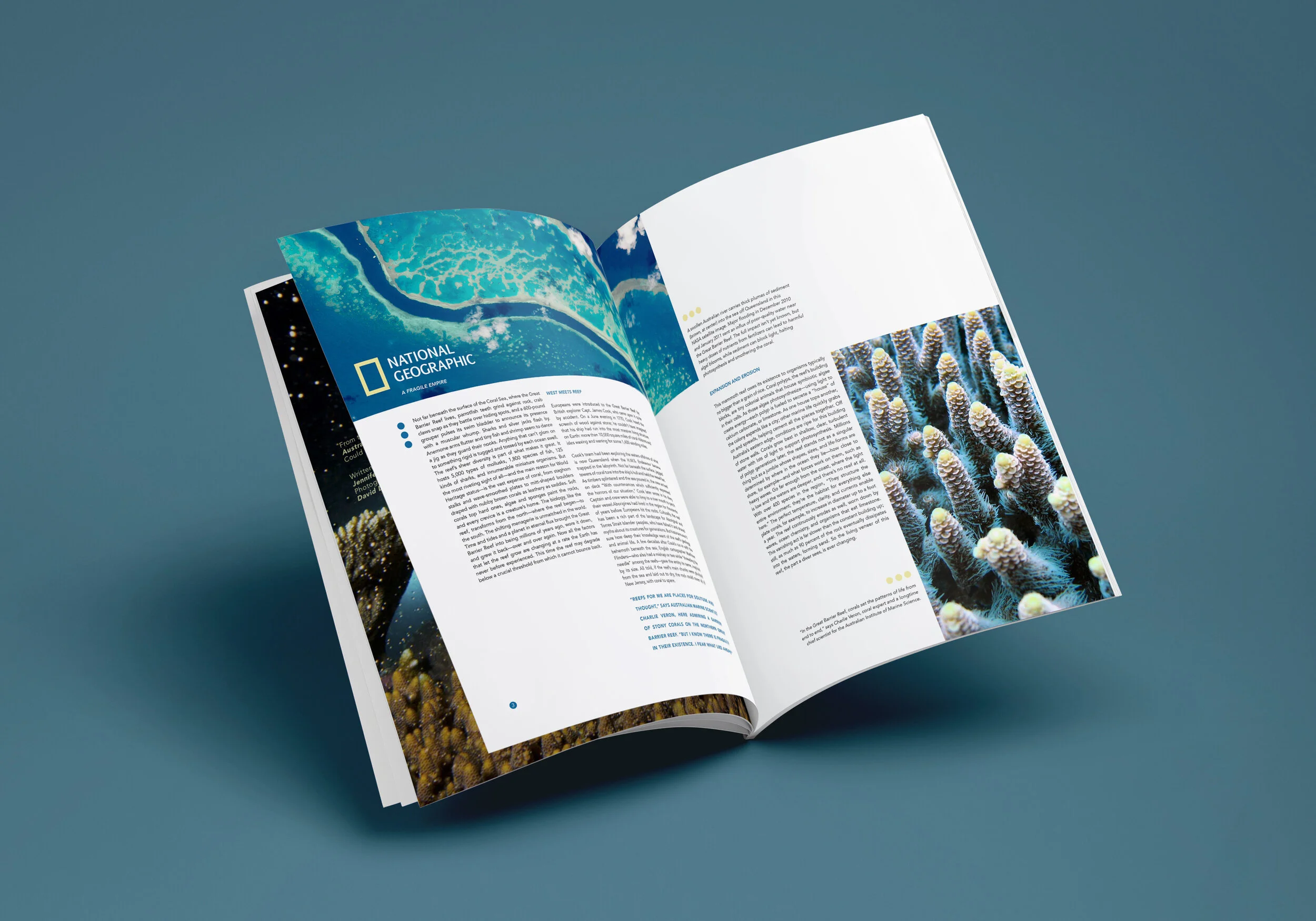
The opening spread is designed to make the viewer feel uneasy. A dark, mysterious image paired with bold typography reading “A Fragile” immediately captures attention, while the word “Empire” is pushed into the background. The typography is formed from polyps dissolving into a dark abyss—symbolizing that while empires are typically strong, this one is slowly falling apart.
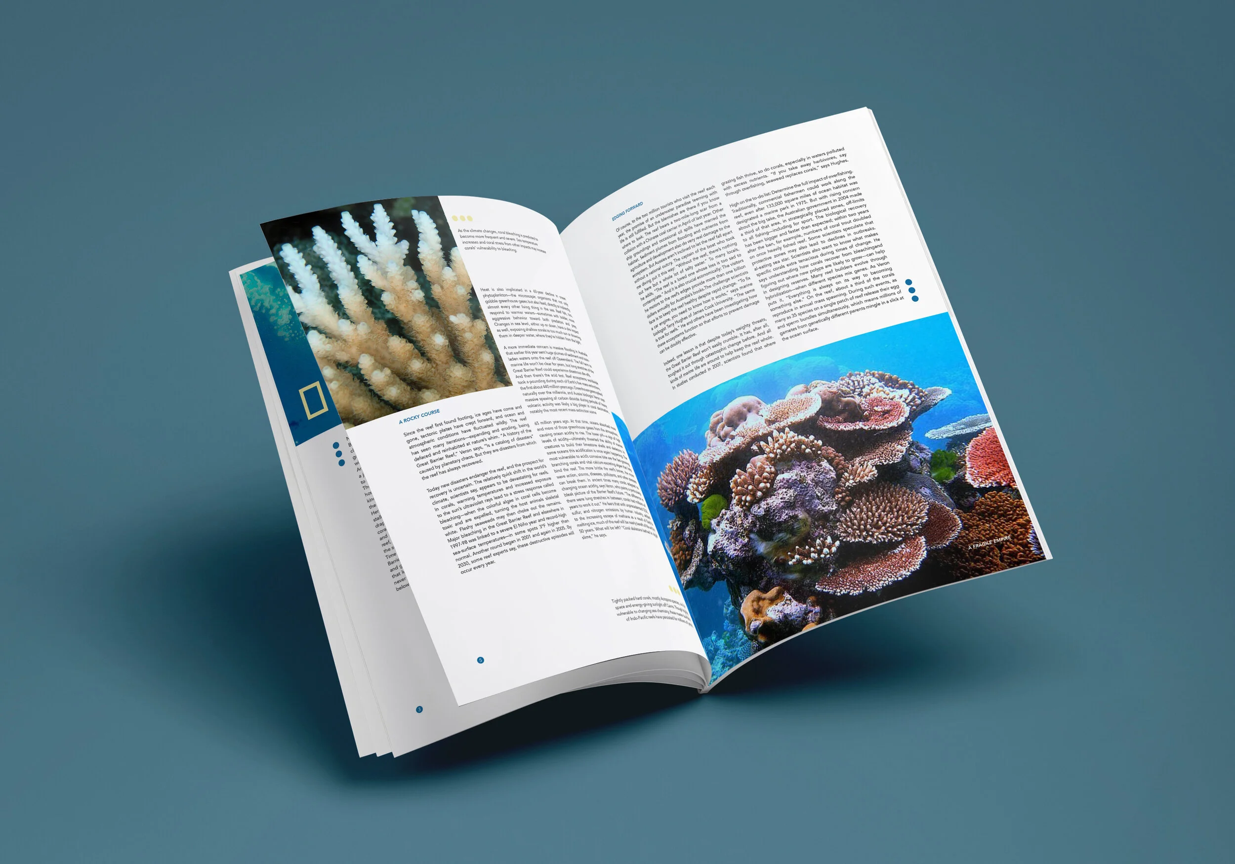
As the viewer moves to the next page, the layout shifts dramatically, bursting into a vibrant blue. The justified type allows the eye to focus and move comfortably through the text while engaging with the surrounding imagery.